About Project
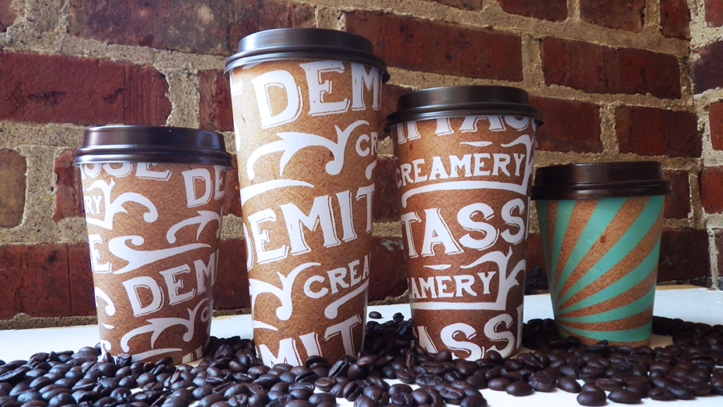
This project was assigned in a Packaging Design corse I took at the University of Missouri. The class was given a brief on a fictional coffee and creamery company and tasked with creating a suitable logo, color palette and packaging with labels for 4 coffee sizes, 3 coffee bags and 3 ice cream containers.
I decided to form my concept around the 1893 Chicago Worlds Fair once I discovered during research that the coffee grinder was used in the fair and coffee was a popular beverage. From there, I mood boarded images around the fair, what people were wearing, what labels looked like, and created a logo to reflect such an influential time.
The challenge with this project was presenting all the items as a collection, they needed to look cohesive with each other sold as a group. Printing out paper mock-ups and pinning them aligned on a wall allowed me to see how they could fit with each other, and how far I could take their differences.
I also added a bonus challenge with screen printing the coffee bags by hand and with every mistake, you have to start over. I learned to begin with printing a desired color palette and mixing paint to match that color palette, let it dry, and adjust my paint mix as needed.
I really loved how my concept came together over the Chicago Worlds Fair. At this point in school, I had no idea I would be living in Chicago for 5 wonderful years.
Awards & Recognition
Hand-drawn logo and illustrations
Screen-printed coffee bags

