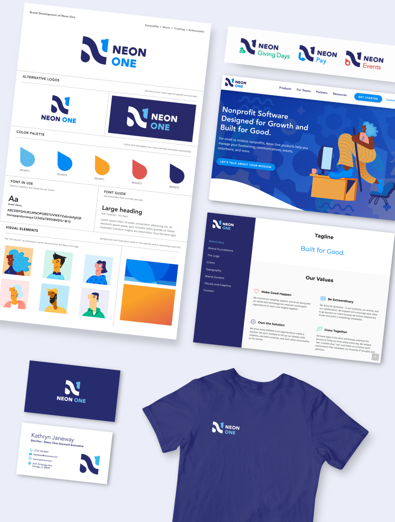
About Project
In 2020, I rebranded Neon One, a software company which focuses on market funding for non-profit organizations. My efforts included a new logo, a new color palette (backed by color theory), a new website design, and branding guidelines. This was a massive undertaking, which would normally be supported by a creative agency. In this instance, I owned and ran the visual direction entirely on my own. The new brand was launched in January 2021 and deemed as a huge success according to multiple client testimonials and even persuaded on-the-fence sales and partnerships.
See Below for development walk through.
Awards & Recognition
“Great job in the all-hands – the visuals are really coming together nicely and you did really well walking through each of the components. I’m really excited about the new branding.”
– Neon One CEO
My Process
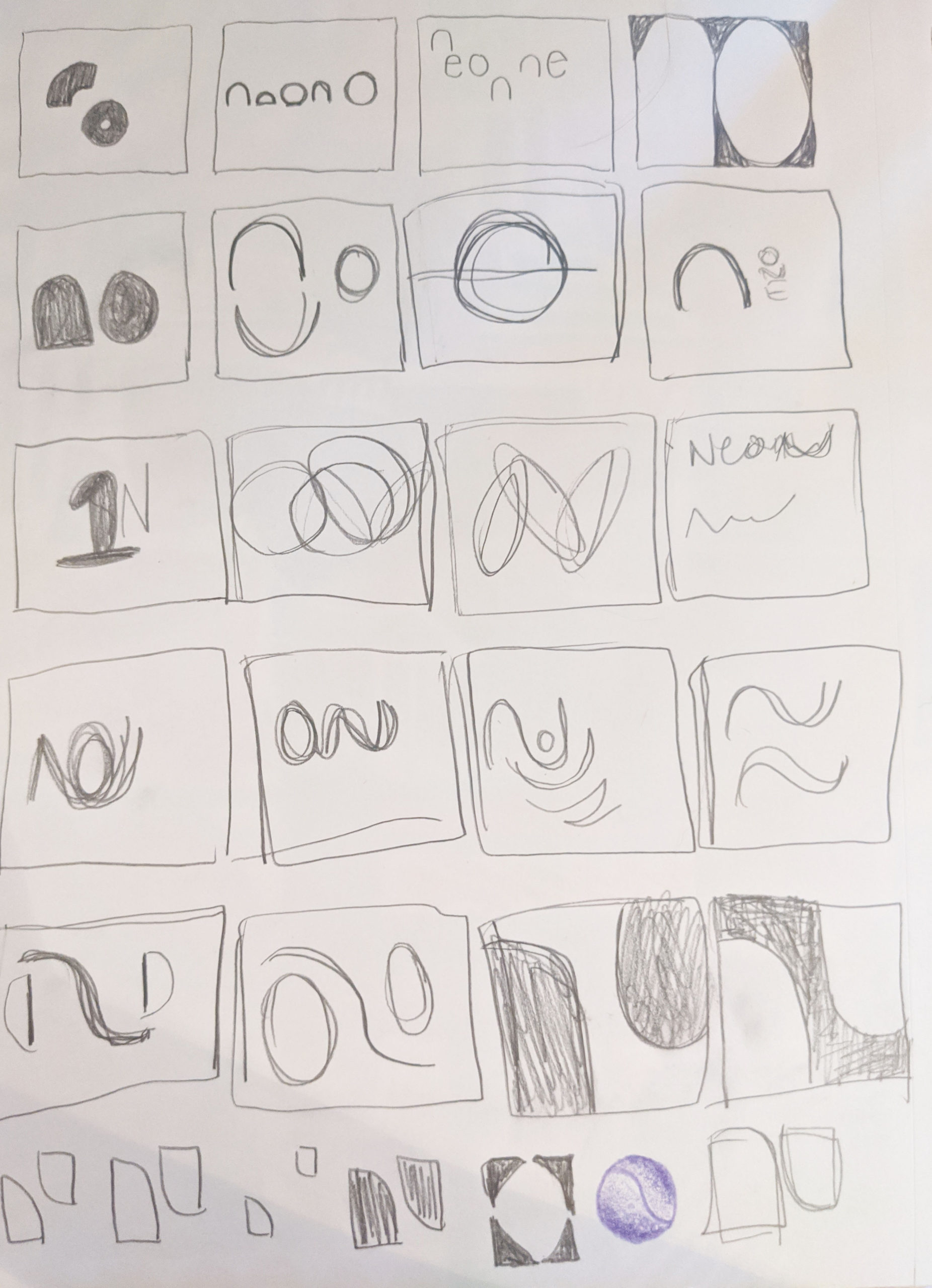
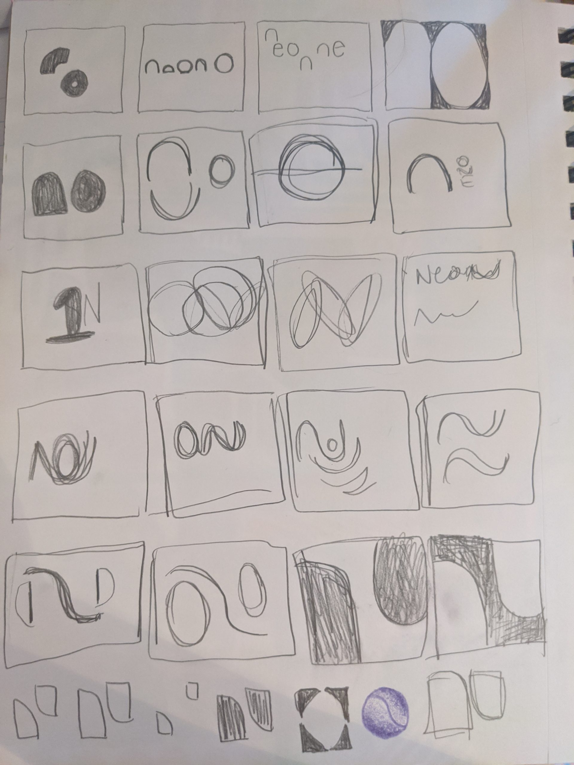
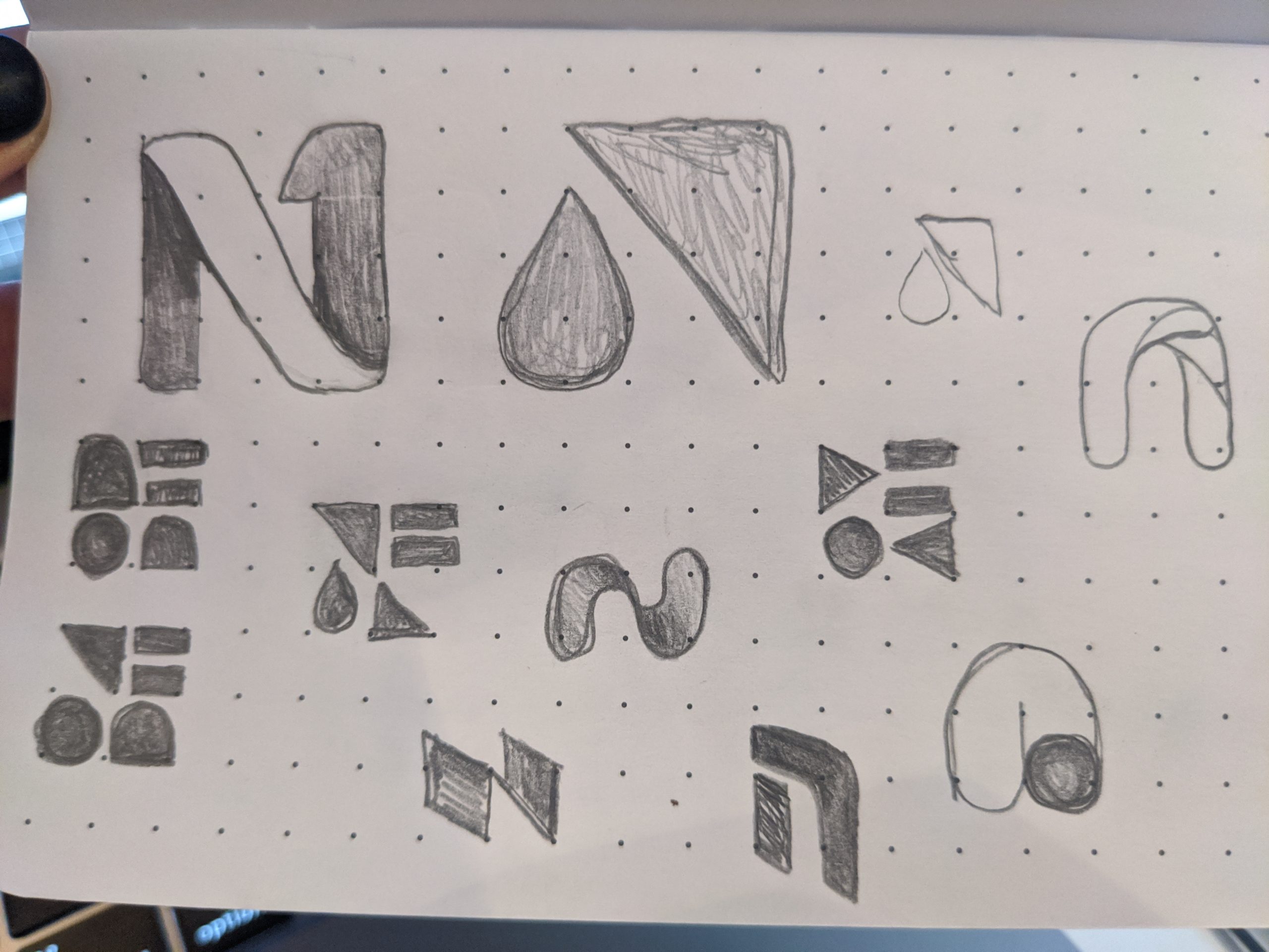
Exploring the N Letter Form
During the concept development process I decided to do a deeper study of the letter form N. The letter N has some unique qualities as it can bend and move in many ways and still retain it’s readability as an N. This prompted me to push the envelope of this letter form and try ways to bring in symbolism while maintaining the N (3 N’s in company name). The goal was to exhibit characteristics of a water current as that concept represented flexibility, innovation, transparence and reliability. Like water, our ability to bend and problem solve around our client’s daily obstacles is our strength.
Findings:
Neon One is a Change-maker. We are committed to advancing the common good.
- System flexibility
- Accessible support
- Evident of growth
- Actionable Data
- Clean and clear needs
- Transparency
Media
Drawing
Graphite
Client Interviews
Stakeholder Interviews
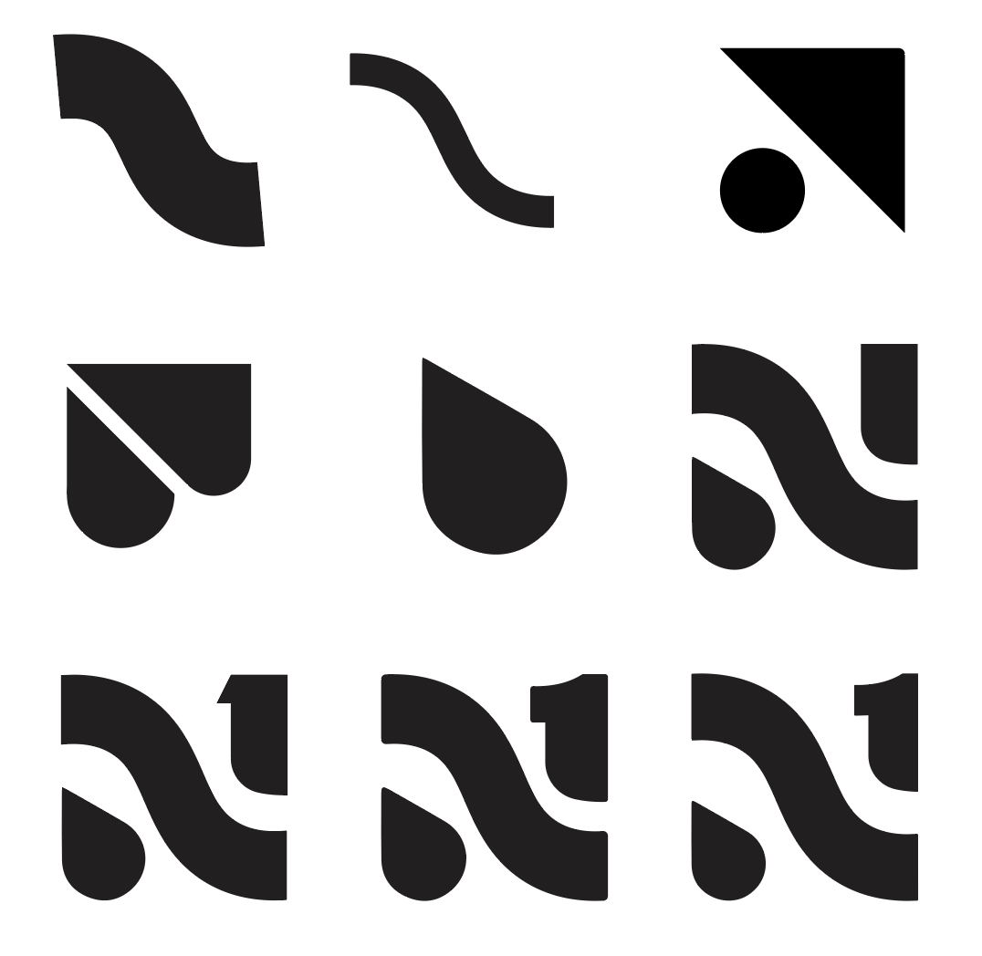
The N + Impact / Flexibility
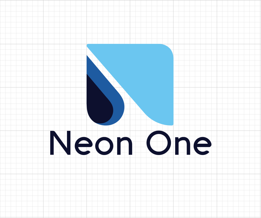
After much exploration I discovered several logo marks that successfully combined the letter N and characters of a water current into a shape. I wanted to simplify the mark as much as possible to strengthen it’s ease-of-use and versatility. I also explored rounded or more sharp corners. The rounder corners I felt matched with the more friendly look we were wanting.
At this point, I pitched several different logo directions to our leadership team and reviewed their conceptual potential.
Findings
A logo MUST match a company’s mission statement, beliefs, target audience and style.
The degree of playfulness in a brand is the degree of change a business is asking their buyers to be on board with.
Media
Adobe Illustrator
Adobe Photoshop
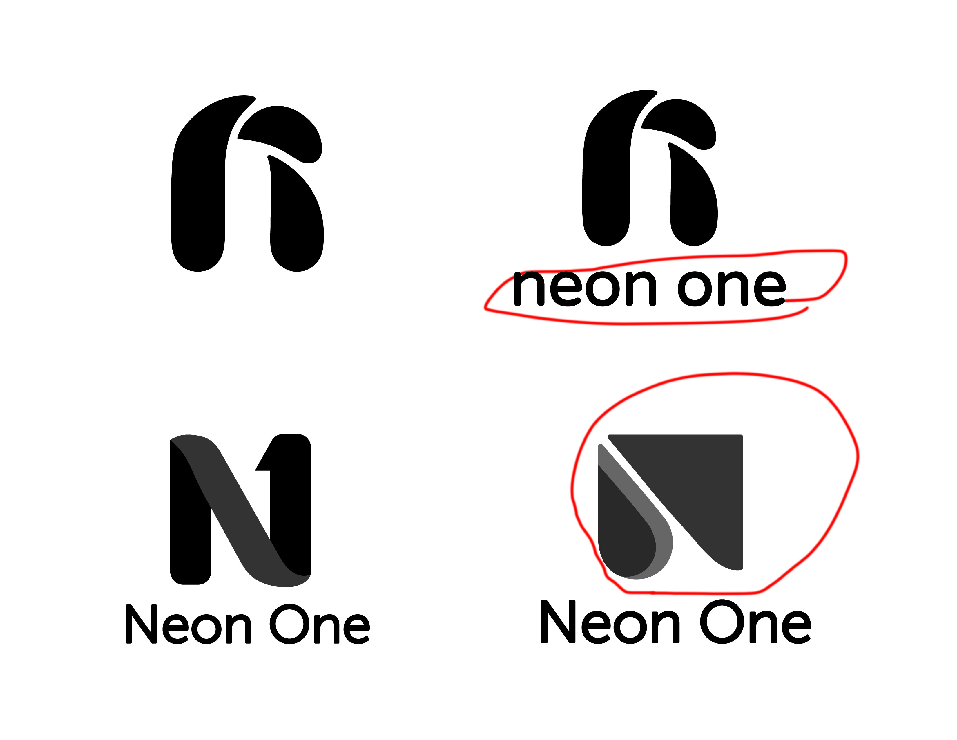
Choosing a Favorite
Our marketing team sent out our logo options to a few of our trusty clients to get some general feedback on the direction of the brand. There were two favorites that also conveniently aligned with our leadership team’s favorite. If this had not been the case, I would have prioritized our target audience feedback. It became more clear this was about a brand FOR our clients and not a brand for a company.
Findings
“Compassion run software”
This is a brand to tell the story of our clients, NOT a story about the company.
Media
Adobe Illustrator
Adobe Photoshop
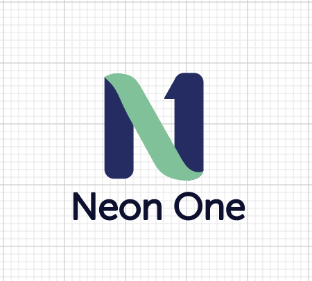
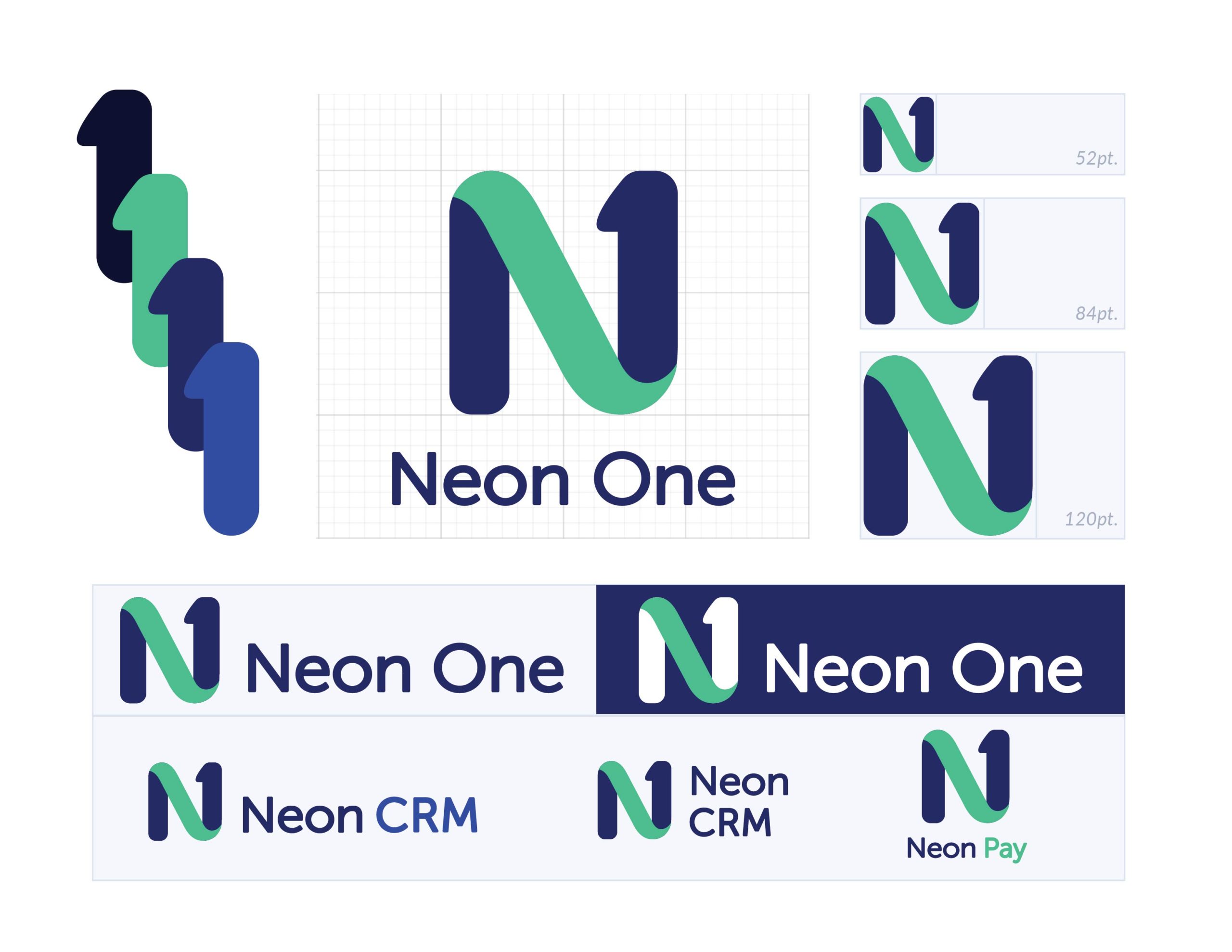
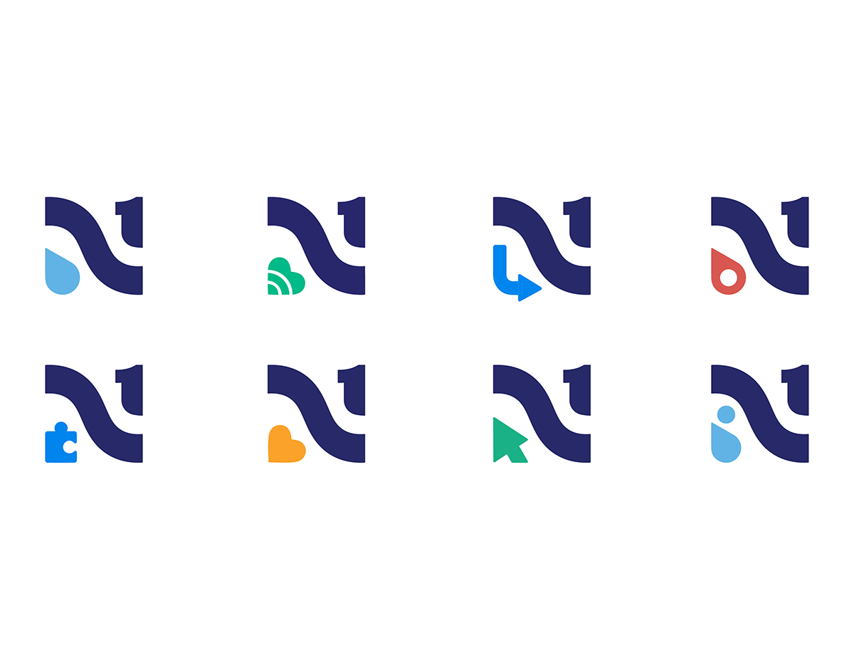
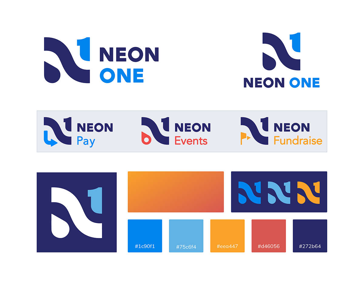
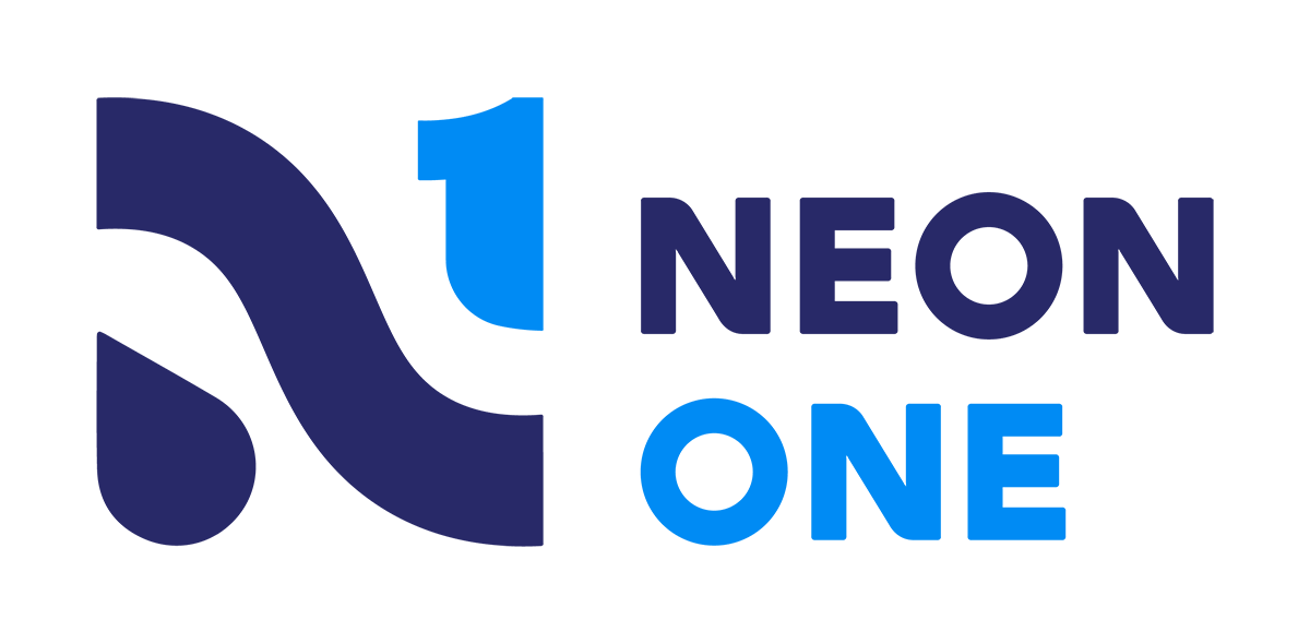
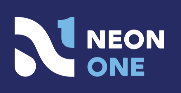
The Logo System
A decision on a logo direction had been made and my next task became to completely hone in the logo styles and variations.
Standard Presentation (Horizontal)
First, is the preferred logo format when possible. It maintains a nice lockup that works well with social media, website banners and traditional print methods. Alternative Presentation (Vertical)
In other situations a vertical presentation may be needed. The text will become center aligned to align the number ‘1’ with the word One and the ‘O’ in Neon with the droplet. Monogram
The ‘N’ monogram is used in cases where an established familiarity with the Neon One brand and/or space is too limited to use the horizontal or vertical alignment versions.
Findings
Spacing for the logo can be repeated in various parts of it’s entirety.
Media
Adobe Illustrator
Adobe Photoshop
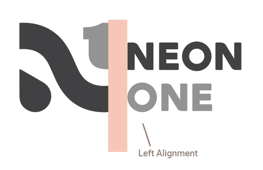
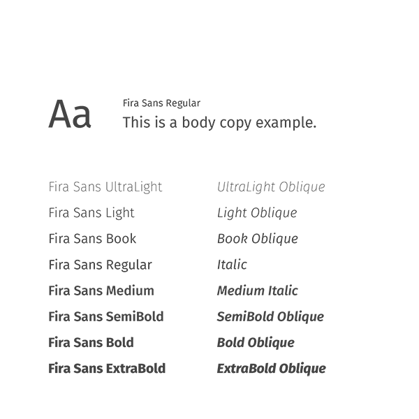
Finding the Right Modern Typeface
I wanted to find a typeface that had the same square symmetry as the icon for consistency. Once I decided on Avenir, I rounded the top and bottom of the Ns to fit more with the current flow of the icon.
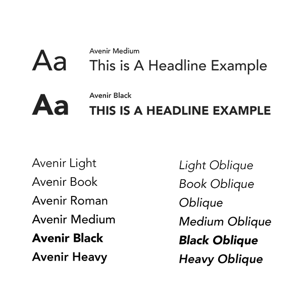
The primary fonts include Avenir and Fira Sans. These are both sans serif fonts, allowing for great legibility and flexibility as far as usage. Avenir is our heading font; it is seen normally in marketing platforms and print titles, while Fira Sans is our body font, used for paragraphs and lower hierarchy text. Below, our guides provide use cases and alternate options for our fonts.
Findings
The left alignment follows the flow of the ‘current’ shape in the N so that the icon flows into the company name.
Media
Adobe Illustrator
Adobe Photoshop
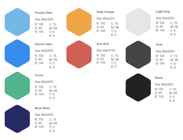
Color
Colors were chosen based on a few factors:
- Accessibility – All our colors were carefully selected to be ADA compliant so our brand could be seen together on screens by people with vision difficulties.
- Warm, care and compassion – orange and red adding a variable or compassion and enthusiasm and nodding to the history of Arts People (red).
- Growth, stability and innovation – Blue hues have proven to evoke feelings of trust, freshness – fresh ideas and innovation or renewal.
Findings
Spacing for the logo can be repeated in various parts of it’s entirety.
Media
Adobe Illustrator
Adobe Photoshop
Adobe XD