Key takeaways:
- Replaced a third-party homepage that looked polished but wasn’t converting or explaining the product
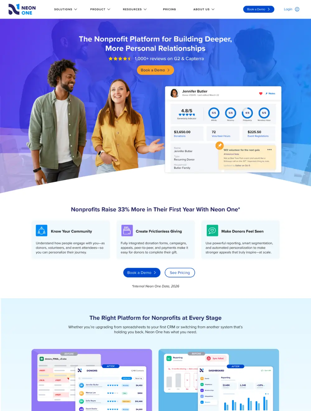
- Took a mockup from marketing and owned all visual execution, designed around driving people to “Book a Demo”
- Built an interactive hub-and-spoke diagram to show how 8 connected tools work as one system
- Created all custom product graphics
- Tested multiple hero versions with real customers via Helio before finalizing direction
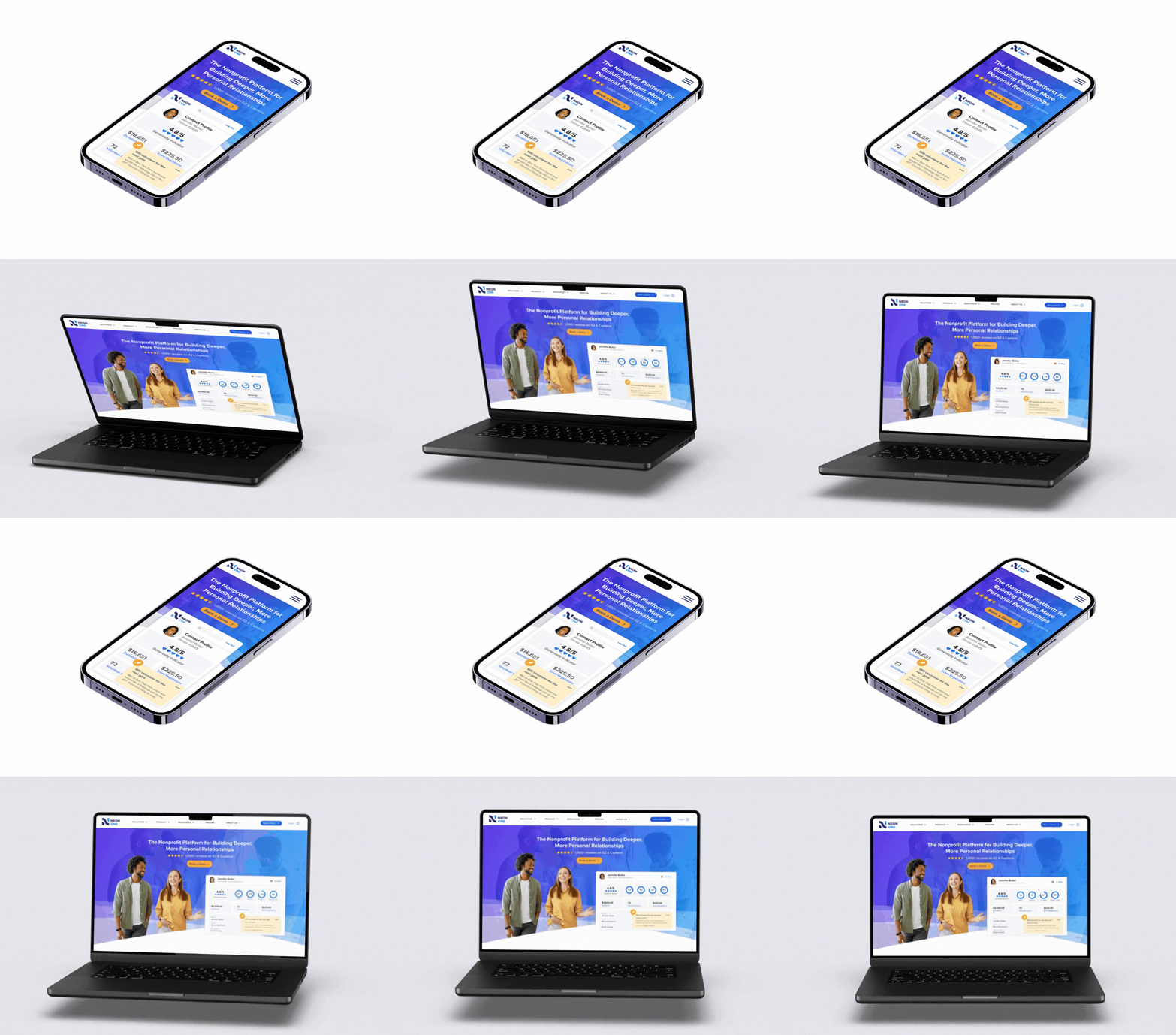
- Built 2 full homepage versions plus mobile; currently running an A/B test in CrazyEgg against the old page
- Walked away with a repeatable page-redesign process (goal, success metric, user, problem, desired action) and a reusable interactive diagram
- Designed using Figma
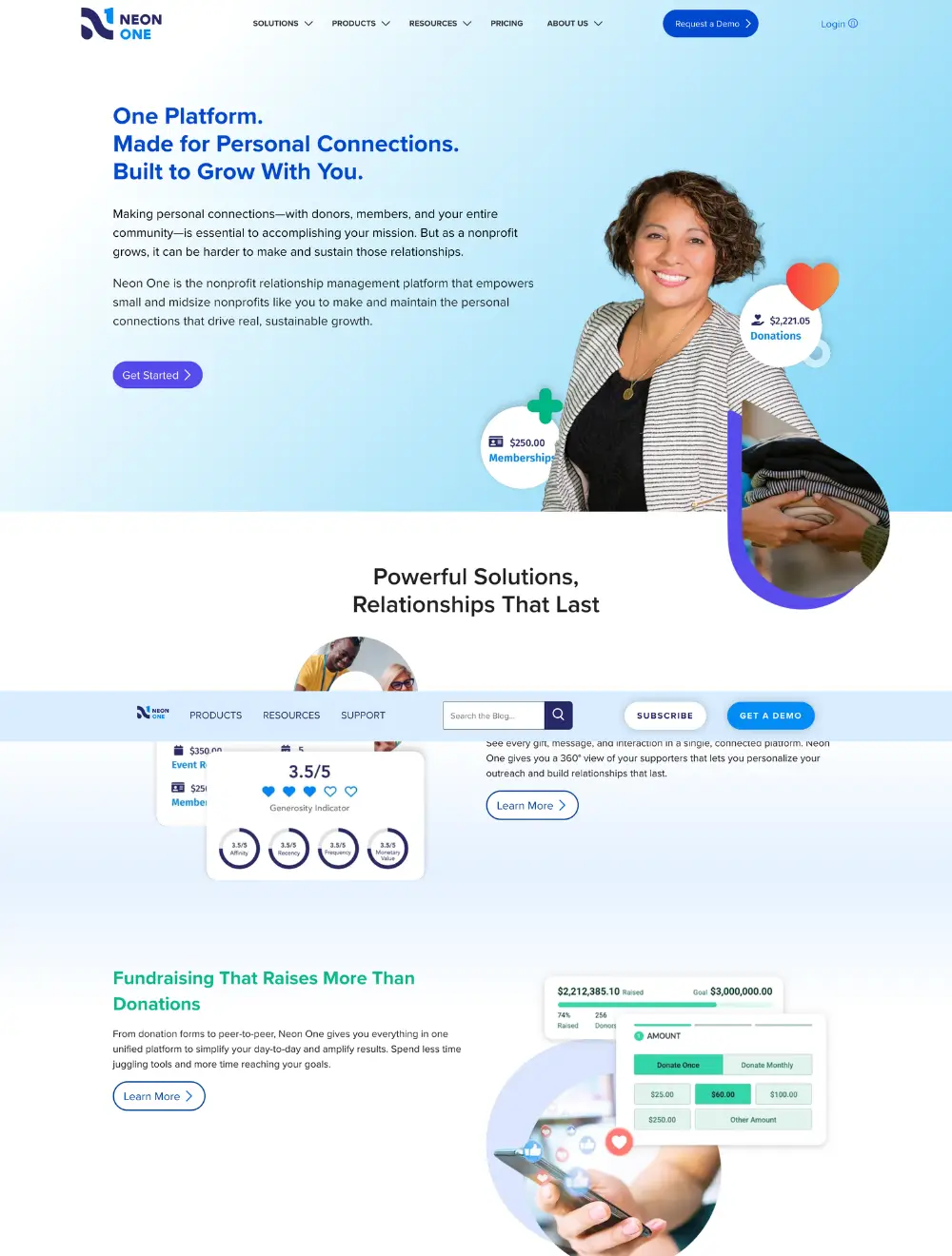
Before:
After:
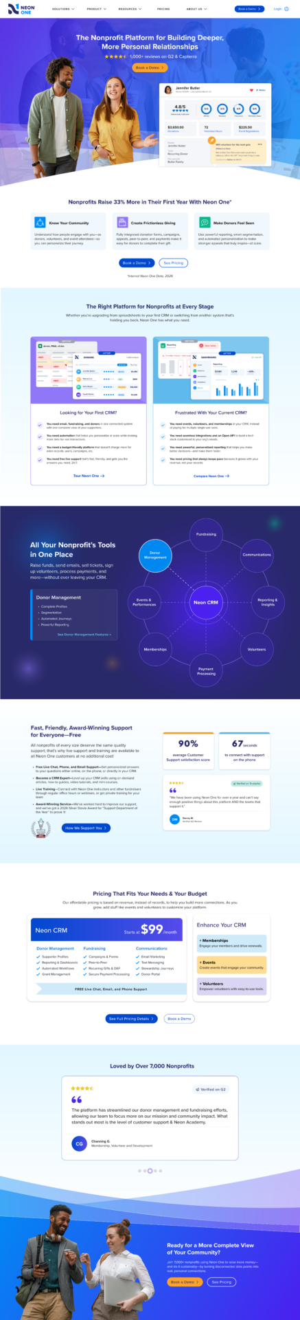
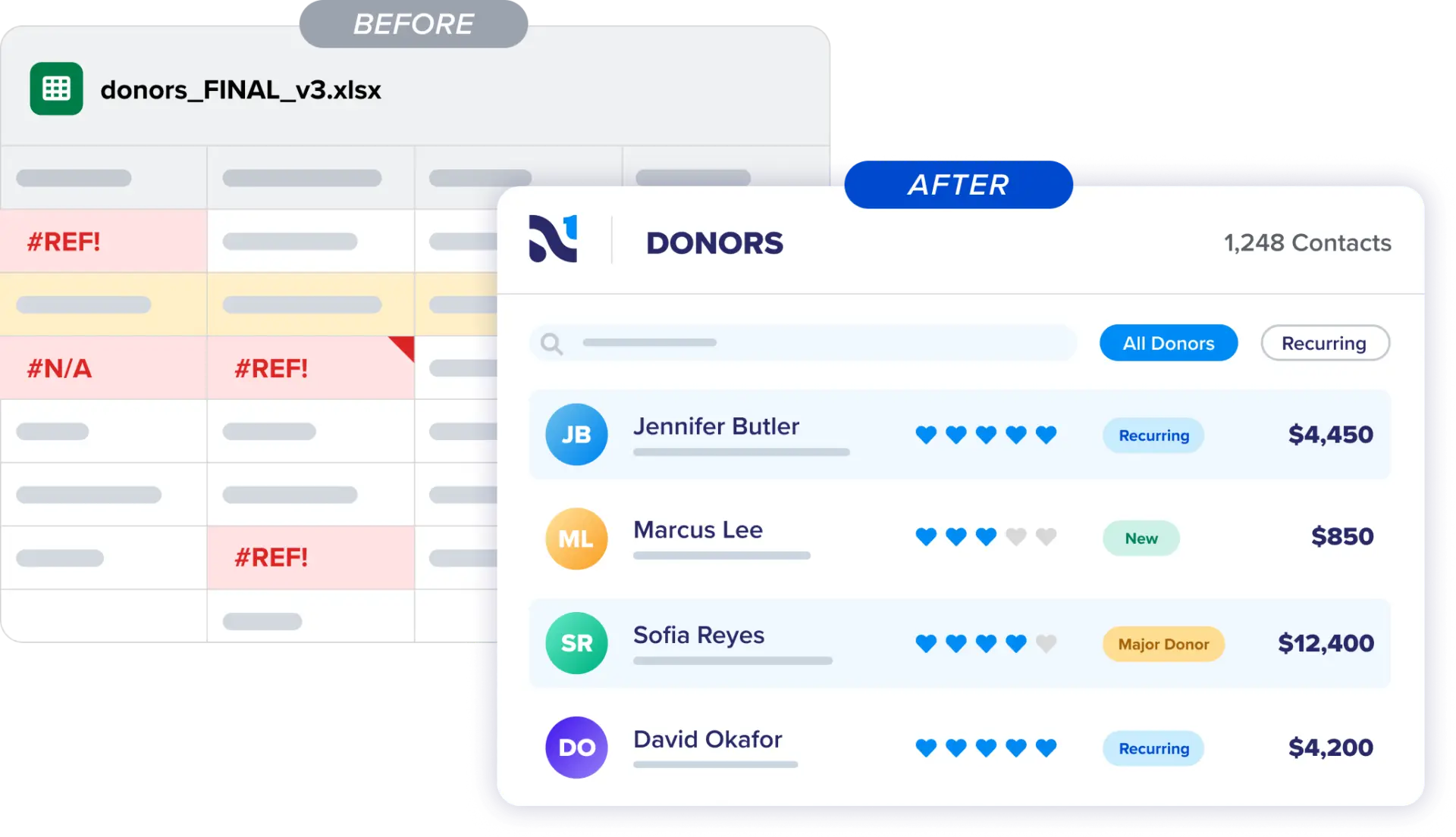
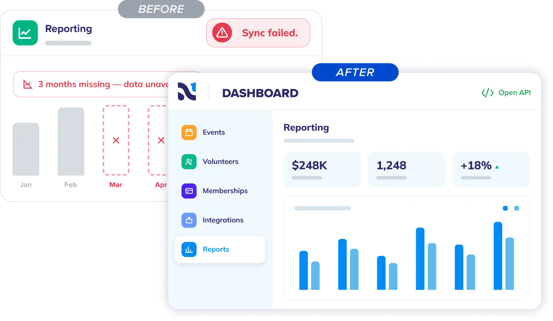
The problem
The homepage before this project was built by a third-party design agency. It looked fine, but it wasn’t converting. People landed on it and left. Nothing on the page was built to move someone toward a next step, and it didn’t do much to explain what the product actually was. Neon CRM is made up of eight different tools that all work together, and the old page didn’t communicate that. It just listed features.
My role
Marketing built a mockup around a conversion goal and walked the team through it. I owned everything visual from there, designing with empathy for our audience and driving them toward ‘Book a Demo’ as their solution.
Part of the challenge was figuring out how to show a system made up of eight different tools (fundraising, communications, donor management, reporting, volunteers, payment processing, memberships, events) that all talk to each other seamlessly, without it turning into a cluttered mess. I designed an interactive hub-and-spoke element for this. Neon CRM sits at the center; each tool is its own node around it, and interacting with a node shows how it connects back to the core system. It lets people explore the product architecture instead of just reading a list of features.
All the product graphics on the page were custom-built by me, and every image was chosen by me too.
How it worked
The marketing team and I worked together to land the right hierarchy and pacing. What should someone see first? What’s the one action we actually want them to take? Where does attention get lost right now? Once we had answers, I built a layout with a clear visual hierarchy and one primary path to conversion, instead of five different calls to action competing with each other.
Marketing owned the message. I owned how it moved down the page and what got visual weight.
I designed several versions of the hero section and tested them with a group of our customers through Helio. The version that tested best for clarity, understanding of the product, and how much it resonated is the one that moved forward.
I also built two full versions of the homepage and a version for mobile. Two made it to final review. The one that shipped is currently being A/B tested against the previous homepage.
Results
The new version is performing slightly better so far in the A/B test we set up in CrazyEgg. It needs more time running to get a clearer answer.
Beyond the numbers, this project gave us a fresh design and a repeatable process for redesigning pages going forward. We start every page redesign by answering a set of questions up front: What’s the goal of the page? What does success look like? What action do we want users to take, and how will we measure it? Who’s the user, what problem are they trying to solve, and what do they need to feel or understand?
We also walked away with a diagram that shows how our tools work together, both as an abstract concept and as a functional web element, clickable and rotating, that we can reuse elsewhere on the site.
Why this project matters
Most of my work at Neon One runs through collaboration, this project included. What made it worth writing up is designing into someone else’s copy first, translating a system of eight interconnected tools into something people could actually explore, and coming out the other side with a process the team can reuse on the next page redesign.