


Art/Works was founded in June 2022 by myself and two other creatives living in Mexico City. The three of us met an an exhibition and began discussing the lack of studio spaces available in Mexico City that met the needs of our schedules and artist resources.
After outlining a business objective and finding a building that suited our space needs, I began pulling together designs for a logo and brand guides.
Art/Works brings inspiration and innovation to artists and remote workers by providing a space for collaboration and opportunities to connect with other creatives in the CDMX community.
Our target audience is mainly late 20s to early 40 year old remote workers. We wanted to also make sure we were impacting the community in a positive way since we were all foreigners and gentrification had began to become a topic of the neighborhood. Because of this, we implemented special membership discounts to local artists from Mexico.
Our objective was to offer a warmer, more inspiring option for remote creatives as an alternative to the corporate co-working options with high prices. We began holding business exchange events and small tours to welcome folks into our space before we opened so that once you joined, you likely already met some of the peers you would be co-working next to on a day to day basis.
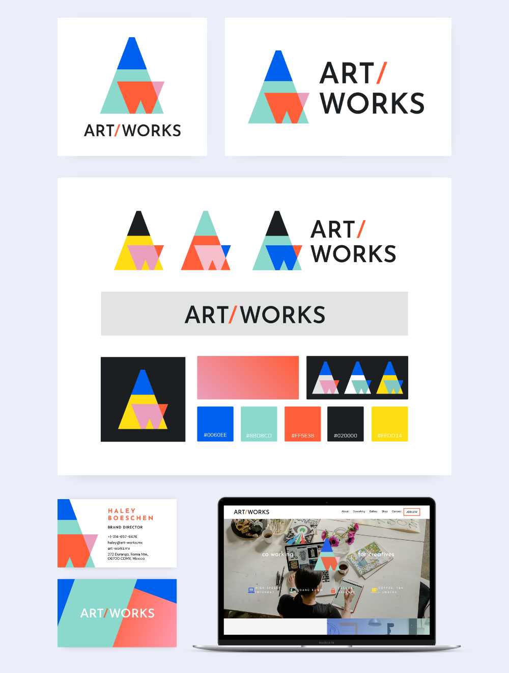
Being both a co-working space and art gallery separated us from a lot of our competitors. I wanted to equally represent these two main functions in our logo because this dual characteristic was what we found missing from the community and from a personal level, what we missed in our own lives.
A lamp, with it’s warm light and the focus it brings on a project felt like a great symbol to represent a gallery and work space. I imagined all the sleepless nights too inspired to lie down that took place under a lamp. This image of dedication was comparable to how long it took us to chose the perfect lights for our gallery. As artists, we knew all too well the disappointment of bad lighting in an exhibition.
At this point in the branding process, my partners agreed they liked the idea of the A/W being represented by a lamp and desk. Although, I could tell there wasn’t commitment to the logos I presented to them. The best way to build commitment to a logo direction was to showcase it alongside different persona verticals we could imagine in the space itself. I organized a presentation placing different logo esthetics next to correlating mood boards. The result of this was landing on a personality tone that then influenced the logo choice.
Once my partners were able to better visualize the brand direction, there was better buy in for the logo design. Next, I began to carve out the details – choosing a final color palette and font face that aligned with our personality and functional needs.
I chose the font with the importance of mobile visibility in mind. Our audience is made up of young travelers who would likely be viewing our content from social media and by ‘word of mouth’ in WhatsAp groups while on the go. This meant a heavier font weight was needed while simultaneously maintaining a sleek modern feel a gallery logo generally allows.
I built and designed the Art/Works website. I also wrote the copy that appears on the website so we could get potential members the information they needed to join.
The 3 of us also each designed a t-shirt to help create excitement around joining and to sell to visitors in our shop.